
The Water Lilies: Green Reflections
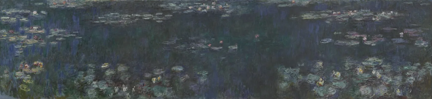
Stand at the edge of a still pond in the middle of a hot afternoon and look straight down. There is a moment, once your eyes adjust, when you stop seeing water at all. What you see is a green mass with things suspended in it, and you cannot tell whether you are looking at the surface, at a reflection lying on the surface, or at something under it. Depth and skin become the same thing. It is mildly disorienting, and most people look away within a few seconds.
This painting is that moment, held for a hundred years, at the width of a wall.
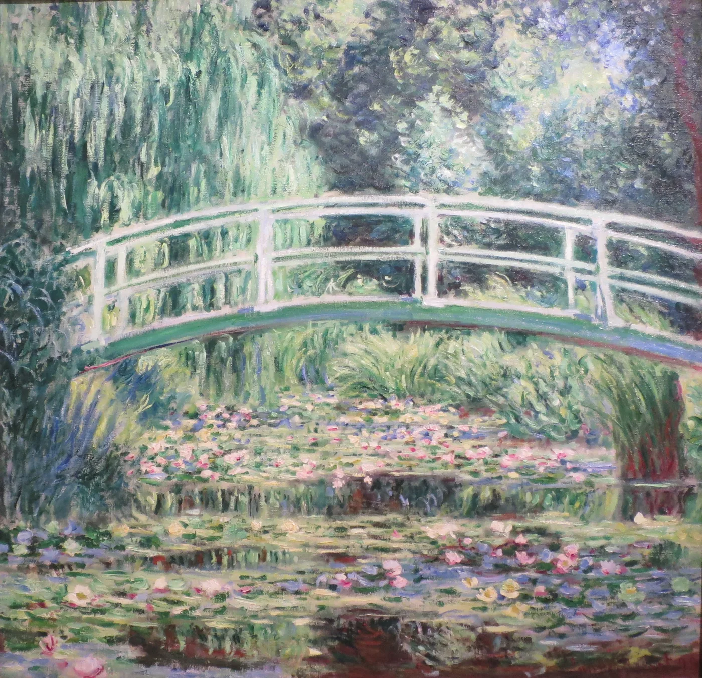
There is no sky in it. There is no bank, no bridge, no willow trunk, no line where the water ends. There is nothing to tell you how far away anything is or how big the picture is meant to be. Among all the large panels he made, this is the one that goes furthest in removing the ordinary furniture of a landscape, and it is the reason it still catches people off guard in a room full of paintings that appear, at first glance, to be about the same subject.
The year he took the sky out of the picture
He had begun as a painter of the visible world at its most legible: bridges, boats, beaches, cathedral fronts. In the 1870s he painted a river with a bridge across it and sails on it, and you could have used the picture to find your way around the town. In the 1890s he painted the front of a cathedral over and over from a rented room, and even there the building held its shape.
By 1920 all of that had been stripped out. The large decorations were painted in a purpose-built third studio at Giverny, from 1914 to 1916 onward, on canvases too big to carry outside, and they abandon the one convention that had organised European landscape painting for centuries: the horizon.
The reasons were partly practical. A picture with a horizon has a built-in size, because the horizon tells you where you are standing and how tall you are. Remove it and the picture can be any dimension at all, which is exactly what he needed for a cycle designed to wrap around a viewer in two oval rooms. He gave the whole cycle to the French state, and it was installed at the Orangerie in 1927, the year after his death.
But there is more to it than engineering. He was in his eighties. He had lost his second wife in 1911 and his son Jean in 1914. He had been told around 1912 that he had cataracts and would keep working through them until an operation in 1923. A painter in that position has some reason to be interested in a picture with no fixed ground and no upper edge.
The making: green is not one colour
The first thing a painter notices about this canvas is how hard it is to do.
Green is the most treacherous colour on the palette. It flattens fast, it turns muddy when overworked, and a large area of it will read as a single dead sheet unless every square inch is kept alive. He is working here with an area of green several metres across and he keeps it breathing the whole way.
Look at how. The greens are not mixed to a uniform tone and spread out. They are laid in as separate temperatures against each other: a blue-green that sits back, a yellow-green that comes forward, an olive that is almost brown, a green so pale it is nearly white where the light strikes a pad. Between them he threads violets and dull reds, sometimes as a single stroke half-buried under later paint. Those warm notes are what stop the whole surface from going cold and flat, and you have to look for them because they are deliberately quiet.
The paint is thicker here than in the paler panels. In some passages you can see the ridge left by a loaded brush dragged sideways, and in others he has gone back into half-dry paint so the underlayer breaks through in streaks. It is not tidy work. It was never meant to be inspected at reading distance, though it survives that inspection better than most.
The pond itself was his own construction. Giverny was rented in 1883, bought in 1890, and the water garden dug from 1893, which meant diverting a branch of the Epte and getting official permission after farmers objected. The Japanese footbridge followed in 1895. The dense summer green in this picture is the green of plantings he chose, grown to the size he had waited for.
Learning to see it: read it as depth, not as pattern
The common mistake with this panel is to look at it as decoration, an arrangement of pleasant green shapes. It is not, and the picture becomes much stronger once you insist on reading it spatially. Try this.
- Find the pads first. The lily pads are the only things in the picture lying flat. They cluster in horizontal drifts, and they get smaller and closer together toward the top of the canvas. That is perspective, working quietly. The top of the picture is far away; the bottom is at your feet.
- Now find the reflections. The long vertical smears of darker green are trees, upside down, lying on the water. They are not in the pond. They are above and behind you, and the painting is showing them to you the only way water can.
- Then find the gaps. Between the reflections there are openings of paler, cooler colour. Those are the sky, also reflected, also above and behind you. So the picture contains a sky; it just refuses to put it at the top.
- Hold all three at once. Surface, reflection, depth. That is the sensation he was after, and once you have it the canvas stops being flat and becomes genuinely vertiginous.
Spend five minutes and you will notice something else: there is no single place to rest your eye. Every composition you were taught to look for, a focal point, a subject, a centre, has been withheld. The picture simply continues. That refusal is the whole point of a cycle designed to surround a person on a curved wall.
How it behaves in a real room
This is the most saturated and most enveloping of the pond panels, and it asks a bit more of a room than the pale ones do.
It is superb in a space you want to feel cool, shaded and deep: a dining room, a library, a bedroom, a room whose windows face onto brick or a wall. Green at this density behaves like foliage outside a window; the room reads as if it borders a garden even when it does not. In rooms already full of plants and wood it is entirely at home.
Wall colour changes it more than with most pictures. On white it looks dense and jewel-like, almost like a tapestry. On a soft warm grey or a putty tone the greens relax and the violets and dull reds inside them come forward, which is the more interesting reading. On a dark green wall it disappears into the surface and becomes atmosphere rather than object, which some people love and others find frustrating.
Keep it away from strong competing colour. A red sofa or a bright rug will fight it and both will lose. Give it neutral company and it will carry the whole room.
Hang it low and wide, with the centre near eye height for a seated viewer, and light it evenly. This is a picture with no focal point, so a spotlight is precisely the wrong instrument; it invents a centre the painter spent years removing.
Sizes and materials for The Water Lilies – Green Reflections are listed on its product page.
More from this collection
Bring this painting home
Choose a hand-painted oil reproduction for real brushwork, or an archival canvas print for a crisp museum-image edition. Every size preserves the original proportions.
View this work & options
Further reading
Verify the original in the Musée de l'Orangerie collection record and continue through related works in the catalogue.