
The Water Lilies: Setting Sun
The last twenty minutes of daylight are the cruellest thing a landscape painter can choose to work on. The colour arrives all at once, it is more intense than anything that has happened all day, and it is gone before you have made a decision about it. Then it does not come back for twenty-three hours, and when it does the weather has changed and you are looking at a different sunset entirely.
Every painter who has tried to sit outside and catch that light knows the specific frustration of it: the sky is doing something you would not have dared invent, your hand is not fast enough, and the light on your own palette is failing so you can no longer trust the colours you are mixing.
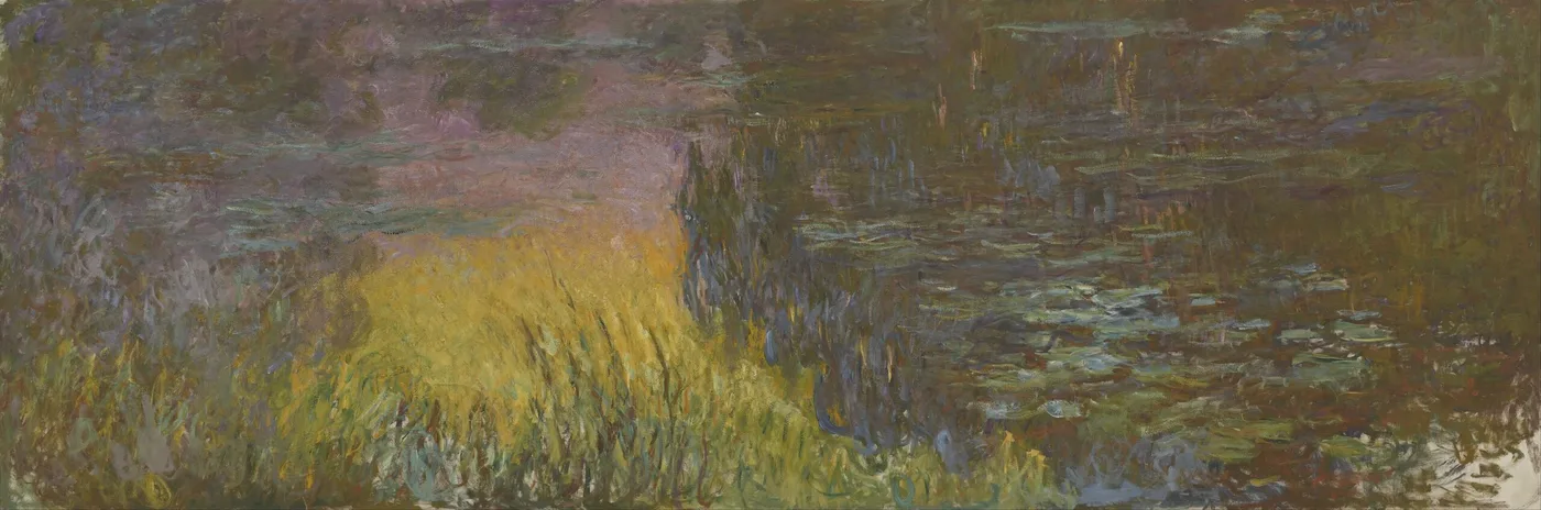
This panel is a stretch of pond at exactly that moment, and it is unmistakably the hottest, roughest and least polite thing in the whole cycle of large decorations.
The one he handled hardest
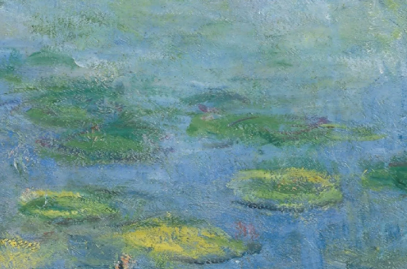
Set this canvas beside the pale morning panels and the difference is not subtle. Those are thin, brushed, cool, worked out over long stretches. This one is thick. The paint stands up off the surface. Strokes cross each other at odd angles, some of them laid down in one pass and never corrected, and there are places where a warm underlayer has been left showing through because covering it would have killed the heat.
Orange and gold run through the water in broad diagonal streaks. Where the light hits hardest the paint is almost sculptural, built up in ridges. Around those streaks he drops in a cold blue-violet that is the true engine of the picture: it is the contrast between the hot streak and the cold water beside it, not the orange itself, that makes the surface appear to burn.
There is an argument to be had about whether it is finished. Passages of it look decided; others look like the last state of a conversation that stopped rather than concluded. Both are true of a lot of what he made in his final years. He worked on the large decorations from around 1914 to 1916 onward and kept revising them until close to the end of his life in 1926, and he was famously reluctant to let go of a surface while there was still something to argue with.
An old man, a giant canvas, and a light that would not wait
The physical circumstances behind this picture are worth holding in mind.
The large panels were painted in a purpose-built third studio at Giverny, put up because canvases of that size could not be handled anywhere else on the property. They stood on low wheeled supports so they could be pushed into position rather than lifted. He was in his eighties. Around 1912 he had been told he had cataracts, and would not have them operated on until 1923; his second wife, Alice, died in 1911 and his son Jean in 1914.
A cataract yellows and warms everything a person sees, and it dims the cool end of the spectrum first. Painters have argued for a century about how much that affected the late work, and it is not a question anyone can settle from the pictures alone. What can be said is that this panel is built on heat, on warm light flooding a cool subject, and that it was made by a man whose own vision was being progressively warmed and dimmed. The viewer is entitled to feel the weight of that without needing a diagnosis to explain the painting.
The sunset itself he knew intimately, and from a pond he had made. Giverny was rented in 1883 and bought in 1890. The water garden was dug from 1893 onward, needing a branch of the river Epte diverted and official permission after local farmers objected. The Japanese footbridge went up in 1895. He had watched the sun go down over that specific piece of water for something close to thirty years before he attempted this.
Learning to see it: find the fire, then find the cold
This is the panel that most rewards close looking, because so much of what makes it work is in the physical handling rather than in the image.
- Find the hottest point. There will be one area where the orange is at its purest and least broken. Everything else in the picture is calibrated against it. Note how small it actually is compared to the impression it gives.
- Now hunt for the blue. Look at the edges of the hot streaks. There is almost always a cold note sitting right against the warm one, sometimes a single stroke wide. Cover it mentally and the heat drops by half. This is the oldest trick in colour and he is using it at full strength.
- Read the direction of the strokes. The light lies across the water in diagonals, not horizontals. That is what a low sun does; it lays a track from itself toward the viewer. He has kept that track and let it cut across the horizontal drift of the lilies, and the friction between those two directions is what gives the picture its restlessness.
- Look at the darks last. They are not black. They are deep green, plum, a red-brown, and they are doing the same job the shadows in a fire do, which is to make the light look hotter than it is.
- Then step well back. At eight or ten feet the thick strokes fuse and the whole surface starts to glow rather than to look painted. That is the distance the panel was designed for.
What you will not find is a sun. There is no disc anywhere in the picture. He is painting the effect of the sun on water, not the object, and the absence of the source is a large part of why the light feels like it is coming out of the canvas rather than being depicted on it.
How it behaves in a real room
This is the one that changes a room’s temperature rather than just its decoration.
Warm pictures do measurable work on how a space feels. Hang this in a north-facing room, or a room that only comes to life in the evening, and it acts like a second light source; the orange reads as lamplight and the walls around it appear warmer than they are. In a room that already floods with afternoon sun it can tip into too much, so think about which direction your windows face before you place it.
It is a natural fit above a fireplace, in a dining room used mainly at night, in a sitting room where the lamps go on at five, or at the end of a corridor where you want a warm point to walk toward.
Wall colour: on white it is emphatic and modern, and the paint texture reads strongly. On a warm mid-tone, terracotta-adjacent clay, deep sand, soft camel, it stops shouting and becomes genuinely enveloping. Against cool grey it is at its most dramatic, because the wall provides the cold note the picture is built on. Against green it can go slightly sour; test before committing.
Give it artificial light with some warmth in it. A very cold LED will fight the palette and drain the oranges. And hang it where people sit, not where they hurry past, because the thing this panel does best is what a fire does: it takes twenty minutes of company before it fully repays you.
Sizes and materials for The Water Lilies – Setting Sun are listed on its product page.
More from this collection
Bring this painting home
Choose a hand-painted oil reproduction for real brushwork, or an archival canvas print for a crisp museum-image edition. Every size preserves the original proportions.
View this work & options
Further reading
Verify the original in the Musée de l'Orangerie collection record and continue through related works in the catalogue.