
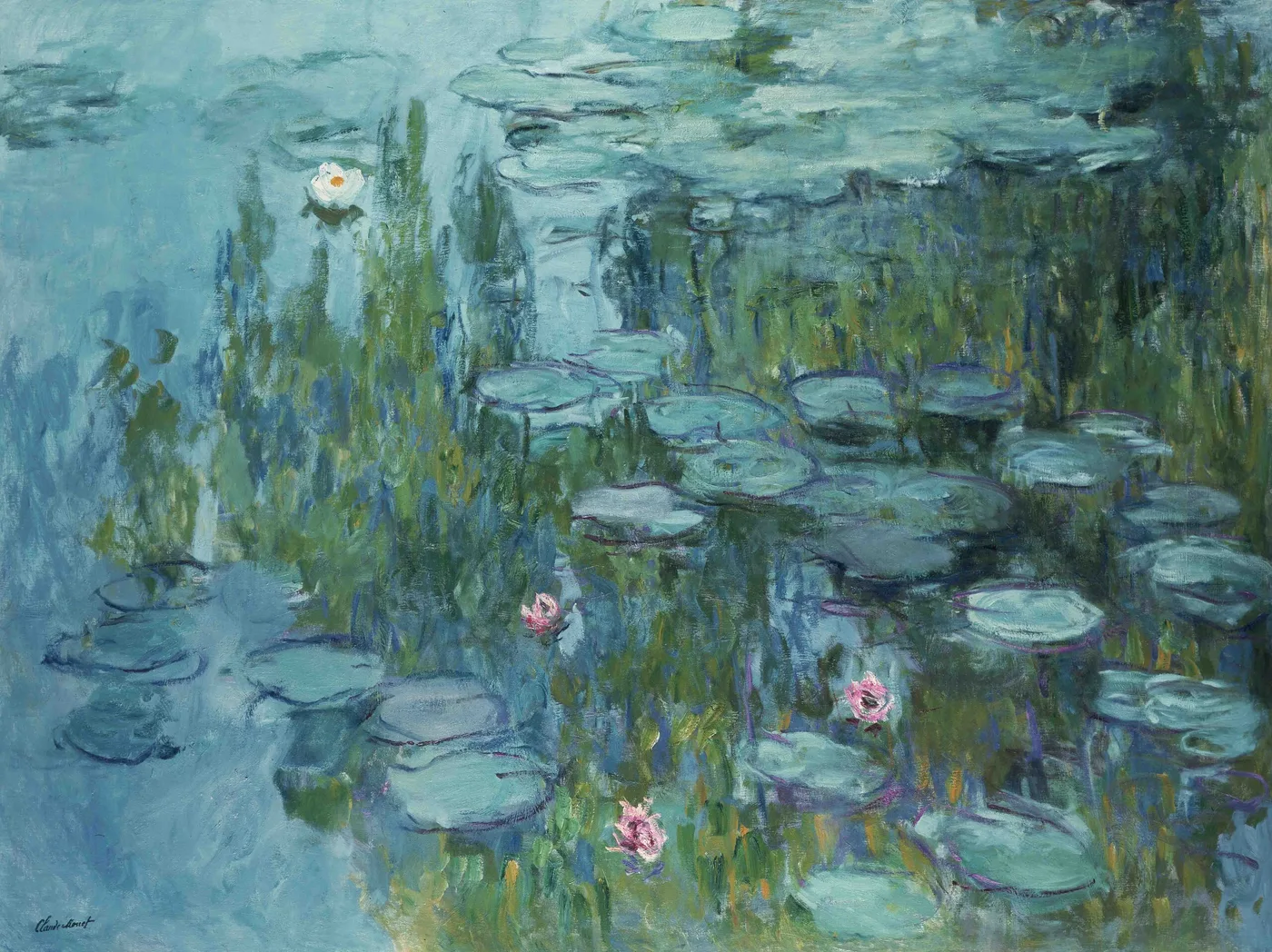
Water Lilies (1908)
Picture a flat-bottomed boat tied at the edge of a pond on a July morning, and a man of sixty-seven sitting in it with a canvas propped in front of him and his back to the garden. He is not looking at the lilies. He is looking down.
That is the whole subject. Not a view, not a scene, not a place you could walk into. A rectangle of water seen from almost directly above, with lily pads lying on it in loose clusters and, in the gaps between them, the sky.
It sounds like nothing. It was, by 1908, the only thing he wanted to paint, and it had taken him fifteen years of gardening and a change in what he thought a picture was for to arrive at it.
Fifteen years of digging before a single lily
Nothing in this canvas is wild. The pond is an engineering project.
He had rented the house at Giverny in 1883 and bought it in 1890, once his work was selling well enough to allow it. From 1893 he began the water garden, which required diverting a branch of the river Epte. That was not a private matter. Local farmers objected, and he needed permission from the authorities before the water could be turned. The concern was practical; people downstream depended on that stream, and an artist’s ornamental pond was not an obviously good reason to interfere with it.
He got his permission, dug his pond, planted it, and in 1895 had a Japanese footbridge built across the narrow end. For the first decade he painted the bridge, the bank, the willows, the whole legible scene. Then, gradually, he cropped all of it away.
By 1908 there is no bridge in these pictures. No bank, no path, no sky at the top of the canvas. Just the water. He had spent fifteen years constructing a subject and then removed everything from it that would let a viewer identify it as a place.
The year the pictures stopped describing and started looking
What separates a canvas of this date from the earlier pond paintings is not the motif. It is the attitude.
The pictures of the late 1890s and early 1900s still describe. They tell you where the pads are, how the light falls, what the bridge looks like at a given hour. By 1908 something has shifted. The pads are still there, but the painting is now much more interested in the confusion of surfaces than in reporting any of them accurately.
Consider what is physically happening on a pond. The water has a surface, which you can see because things float on it. It has a reflection, which sits on that surface but shows you things behind and above you. And it has a depth, which you glimpse in patches where the light gets under. Three different spatial systems occupying the same square inch. Human vision is not built for this, which is why looking into water for a long time is faintly hypnotic.
He had also, by this year, been at the same pond for a decade and a half, in every season and every hour. That kind of familiarity does something to a painter. He no longer had to work out what was in front of him. He could go straight to the harder question, which was what it felt like to look at it.
The making: easel scale, no horizon, and a boat
This is not one of the wall-sized decorations. It is a canvas of the size a man can carry, set up outdoors, and finish in a sensible number of sittings, and that changes the way it was painted.
He worked the pond from the bank and from a flat boat, which gave him the one thing he could not get from the shore: a viewpoint directly over the water with no bank in the frame. From a boat the pond has no edges at all. That vantage is the reason the composition can dispense with a horizon.
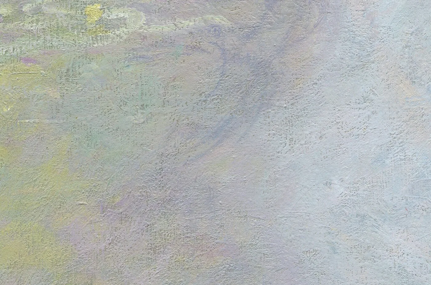
Look at the strokes. In the open water they are longer and softer, dragged in the direction of the reflections, with colours laid wet against wet so the boundaries blur. On the pads they are shorter, flatter, laid across; each pad tends to be built from two or three decisive marks rather than drawn and filled. Where a flower sits, the paint gets thicker and brighter, a small raised knot on an otherwise fluid surface.
The palette is characteristic of this campaign: blue-green water, a cool lilac in the reflected sky, pads in a yellow-green that turns almost olive in shadow, and pink or cream for the flowers. There is very little dark. The picture holds together on close-valued colour rather than on strong contrast, which is the harder way to do it.
Learning to see it: the three depths
The best way into a canvas like this is to refuse to look at it as a pattern. Insist that it is a space, and look for the three layers in it.
- The surface. Find the lily pads. Note that they get smaller and cluster more tightly toward the top of the canvas. That is not decoration, it is perspective; the top of the picture is water further away from you, the bottom is water at your feet. Once you see that, the canvas tilts and becomes a plane receding into the distance rather than a flat design.
- The reflection. Look at the pale, cool areas between the pads. That is sky, lying on the water. It is above you and behind you, and it is the only sky in the painting. Follow one of these openings and you will often find it interrupted by a darker vertical smear, which is a tree, upside down.
- The depth. In a few places the colour goes warmer and murkier, a brownish or olive note. That is the water letting you see into it. These passages are usually small and easy to miss, and they are what stop the picture reading as a mirror.
Then try holding all three at once, which is uncomfortable and is precisely the sensation of standing over real water. Most viewers can manage it for a few seconds before their eye picks one layer and settles. That instability is the painting’s actual subject.
How it behaves in a real room
Because this is an easel-scale picture rather than a wall-scale one, it lives differently from the big decorative panels. It is intimate. It wants to be looked at from three or four feet, not from across a room.
That makes it a good choice for the places where people are close to the walls: a hallway, a study above a desk, a bedroom, a stair landing, the wall beside a reading chair, a bathroom with decent light. It is one of the few subjects that genuinely improves at close range, because the paint handling is legible at that distance.
The palette is cool and light-valued, with no strong dark anywhere, so it lifts a wall rather than punctuating it. On white or off-white it is calm and almost weightless. On a soft blue-grey or a pale sage it merges with the wall and becomes atmospheric. On a strong dark colour it gains a great deal of drama, because the pale water is suddenly the brightest thing in the room.
It also groups well, which the large panels do not. Two or three water pictures of similar size hung as a set read as a sequence of hours rather than as repetition, which is much closer to how he thought about the motif in the first place.
Give it even daylight if you can. This is a painting with no single focal point and no deep shadow, and it looks best in the same flat, generous light it was made in.
Sizes and materials for Water Lilies are listed on its product page.
More from this collection
Bring this painting home
Choose a hand-painted oil reproduction for real brushwork, or an archival canvas print for a crisp museum-image edition. Every size preserves the original proportions.
View this work & options
Further reading
Verify the original in the Tokyo Fuji Art Museum collection record and continue through related works in the catalogue.