
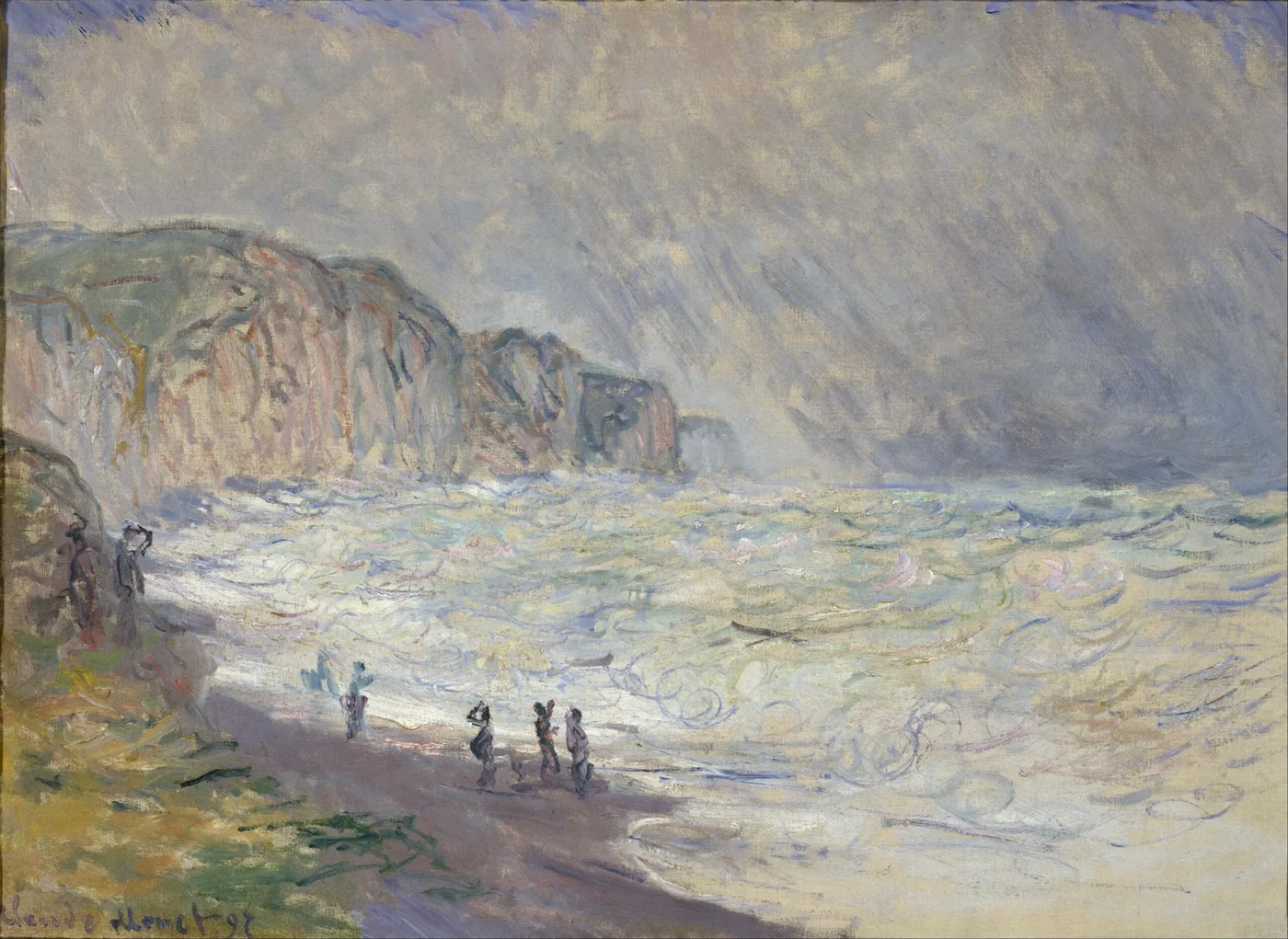
The Nets in Pourville
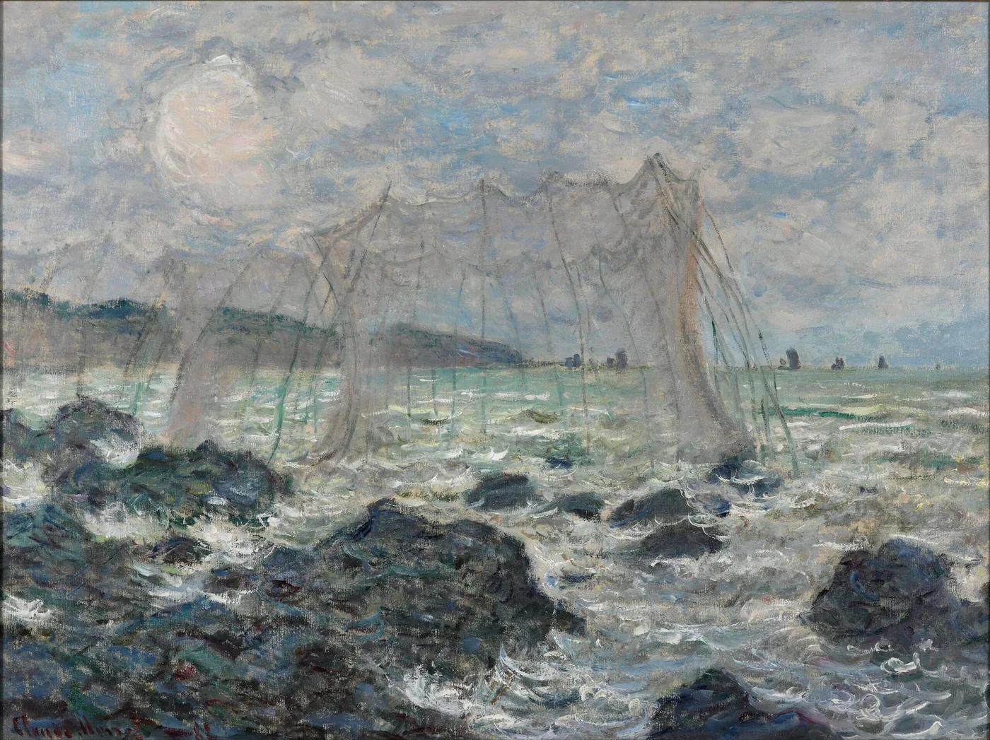
The wind on that coast does not gust; it leans. It comes off the sea in a steady push that flattens the grass on the cliff tops and makes a canvas behave like a sail, and a painter working out there spends as much effort holding his equipment down as putting paint on it. Salt gets into everything. The light changes every ten minutes because the cloud is always moving. By the end of a session your hands are cold, your ears ache, and the picture in front of you no longer matches the weather that produced it.
That is where he chose to spend the early 1880s. Pourville, Varengeville, Dieppe; a stretch of chalk cliff and shingle beach on the Normandy coast, worked in campaign after campaign, in conditions most people would go indoors to avoid.
And on the cliff, spread out to dry, were the fishing nets.
Two kinds of labour on the same cliff
Nets are not scenery. They are equipment, and the reason they are laid out on the grass is that they have to be dried, checked and mended after every use or they rot. Someone hauled them up there. Someone will come back for them.
So a picture of nets is a picture of work, made by a man who was himself at work, in the same weather, on the same ground. That doubling is the quiet subject of this canvas. There is no fisherman in it and no boat needed. The evidence of labour is enough; the nets stand for the people the way a coat over a chair stands for whoever hung it there.
He was not a stranger to the situation. He had grown up on that coast. He knew what a working shoreline looked like when nobody was performing for a visitor, and he painted it that way: not picturesque, not tidied, just the ordinary apparatus of a place where people take things out of the sea.
There is a shadow over these years too. His wife Camille had died in 1879 at the age of thirty-two. The Normandy campaigns of the early 1880s are what he did next: long stretches away from home, working alone in punishing weather, on a coast he had known since childhood. It is not necessary to read the pictures as mourning. It is worth knowing that this is a man who went to the edge of the country and stood in the wind for weeks at a time.
Painting in weather that fights back
The practical facts of this kind of work are worth spelling out, because they are visible in the paint.
A canvas on a coastal cliff must be weighted or tied down or it will go over the edge. He worked with canvases weighted against the wind, and the danger was real rather than theoretical; three years after this campaign, at Etretat in 1885, a wave took his easel.
Wind also forces speed. You cannot stand out there for six hours deliberating over a passage of grass. The mark has to be made and left. Look at the handling in this picture and you will find very little reworking; the strokes are laid in once, at pace, with the brush loaded and moving. Where the grass meets the sky the edges are abrupt because there was no time or reason to blend them.
And cold changes the paint itself. Oil stiffens in low temperatures and drags on the canvas. Some of the broken, scrubby texture in coastal pictures of this period comes from a brush pulling through paint that has gone reluctant, and the result is a surface with a lot of air in it: bits of the underlayer show through, and the ground of the canvas is visible in places where a single dry stroke skipped across it.
The palette is what the coast actually gives you. Chalky greens in the cliff grass, a blue-grey sea that is closer to slate than to postcard blue, a sky carrying weight, and against all of that the nets, which are the darkest and most linear things in the picture.
Learning to see it: the nets as drawing
The compositional idea here is unusual for him and worth pointing out, because it is the reason this canvas is more than a pleasant coastal view.
- Look at the nets as lines, not objects. They are dark, thin and irregular, and they lie across the green of the cliff like handwriting on a page. In a picture otherwise built from broad areas of colour, they are the only drawing. Cover them and the whole thing becomes a bland stretch of grass and sea.
- Follow the direction they run. They pull the eye across and down the slope, toward the sea. They are doing the job a path or a road does in a conventional landscape, which is to give you a way in.
- Then look at the horizon. Notice how high or low he has placed it and how much of the picture is given to land rather than water. He habitually pushed the sea into a narrow band on these coastal canvases, which makes the ground you are standing on the real subject and the sea a fact in the distance.
- Check the sky against the sea. They are almost never the same colour in his coastal work, and the difference between them is usually the thing that tells you what the weather was doing. Find whether the sky is warmer or cooler than the water; that single comparison dates the picture to a time of day.
- Last, look at the grass close up. It is not green. It is a mixture of yellow-green, blue-green, dull violet and, in the shadows, a genuine warm brown. At three paces it becomes cliff turf; at arm’s length it falls apart into separate colours.
The picture has no incident and no anecdote. Nothing is happening and nobody is present. What it has instead is the feeling of a particular kind of morning on an exposed coast, which is the thing he actually went there to get.
How it behaves in a real room
This is the most straightforwardly liveable of his subjects, and it works in rooms where the pond pictures would be too much.
The palette is muted: greens, greys, chalky blues, a few dark notes. That means it sits easily against almost any wall colour and never dominates. In a room already full of pattern or colour it acts as a calm point rather than another competing voice.
It is a natural fit for anywhere you want the sense of air and space: a bedroom, a bathroom, a hallway, a kitchen wall, a study. It also does something specific that closed interior spaces benefit from, which is that it contains a horizon. A picture with a visible distance in it functions like a window in a way that a close-up subject cannot, and in a room with no view or a poor one, that is genuinely useful.
Against white it reads fresh and slightly austere. Against soft blue-grey, sand or pale putty it becomes warmer and more atmospheric and the greens come forward. Against strong warm colours, mustard or terracotta, the sea note can look dull; test it before committing.
It pairs well with natural materials, unpainted wood, linen, wicker, stone, and badly with high-gloss and chrome, which flatten it.
Hang it at standing eye level with the horizon line at roughly the height of a real one, and give it moderate rather than dramatic light. This is a picture made in flat, moving, overcast daylight, and it looks best in something close to that.
Sizes and materials for The Nets in Pourville are listed on its product page.
More from this collection
Bring this painting home
Choose a hand-painted oil reproduction for real brushwork, or an archival canvas print for a crisp museum-image edition. Every size preserves the original proportions.
View this work & options
Further reading
Verify the original in the Kunstmuseum Den Haag collection record and continue through related works in the catalogue.