
Poplars, Pink Effect
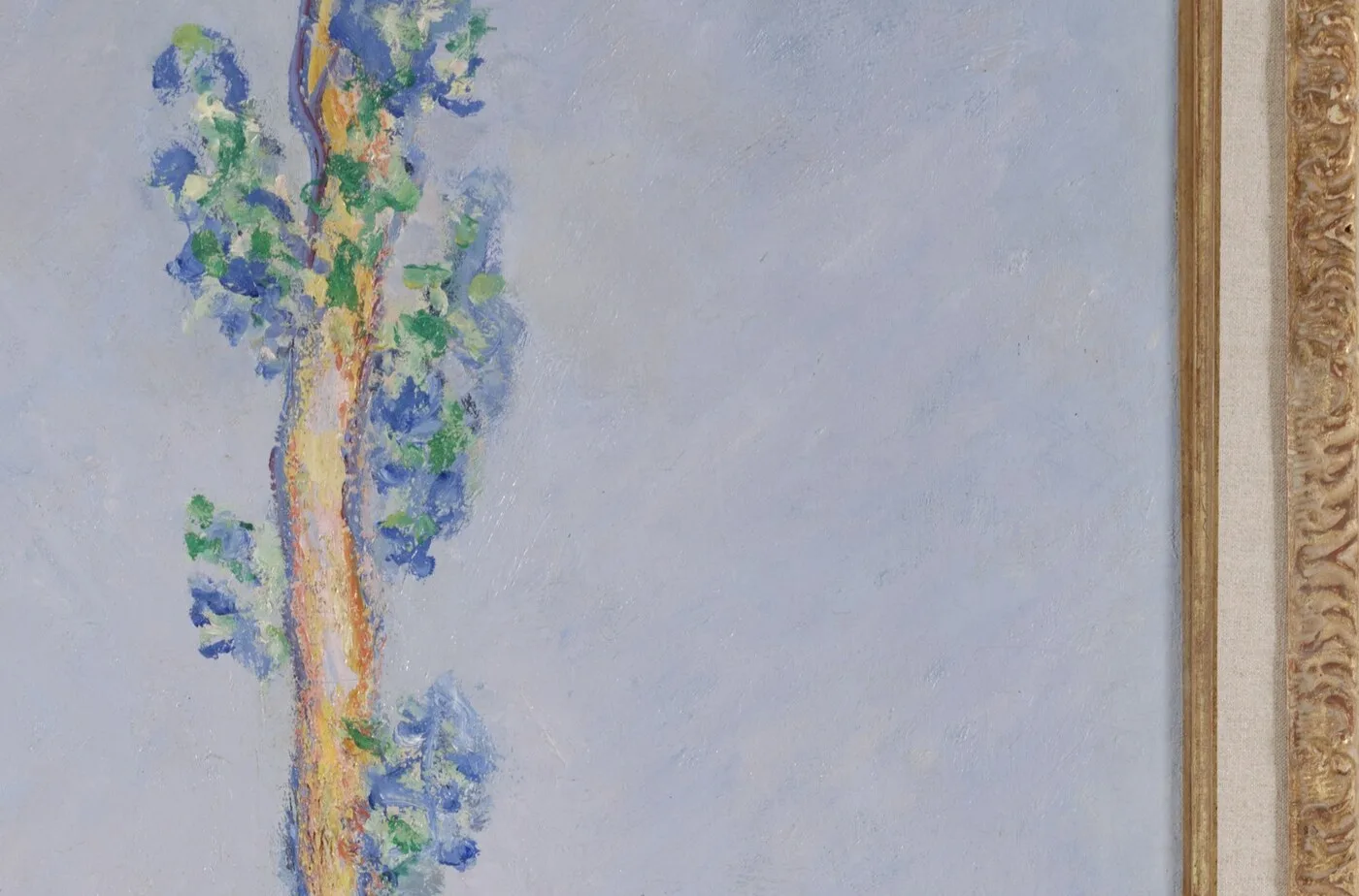
The wind has dropped. That is the first thing to know about this canvas, and everything else follows from it.
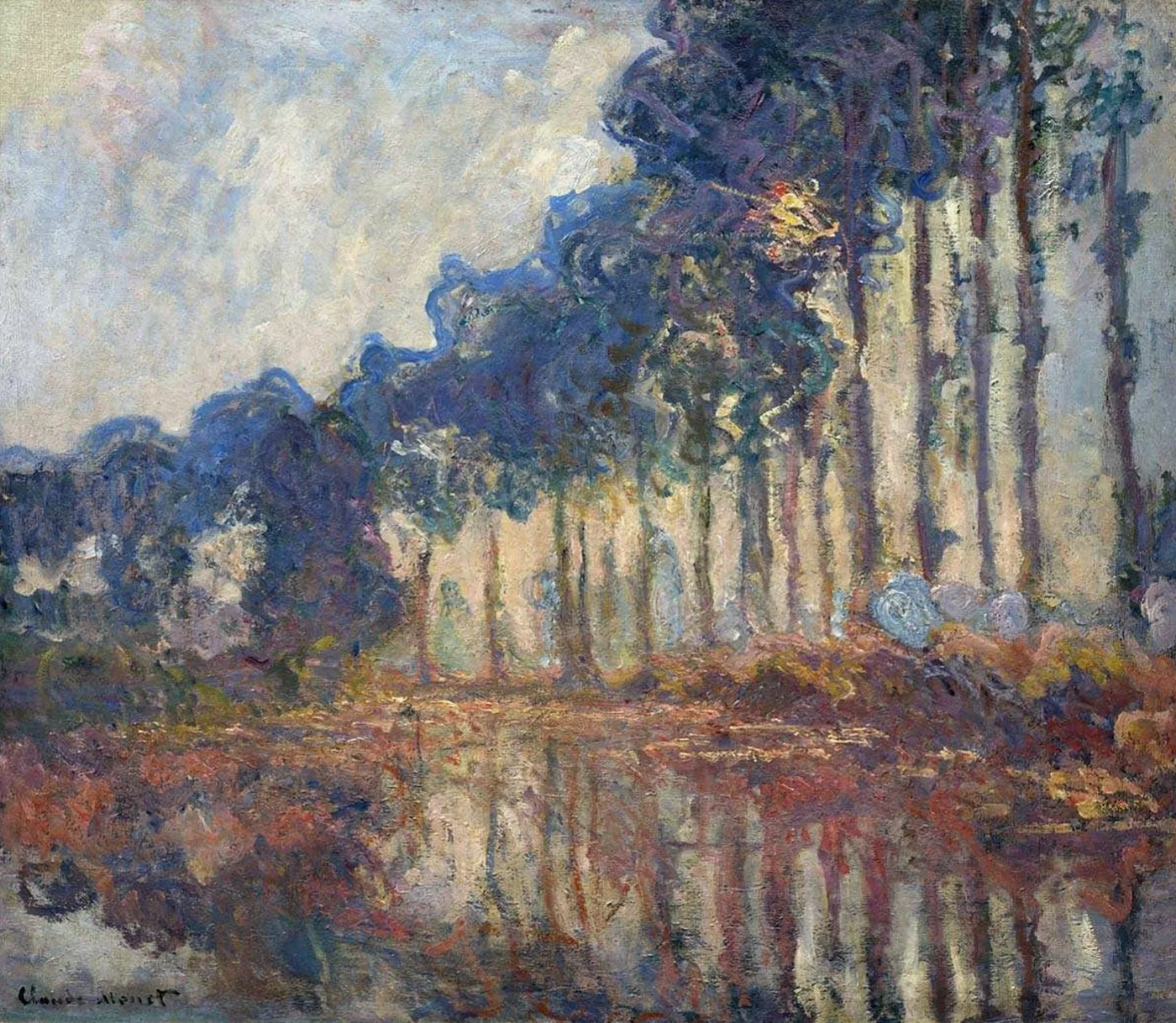
When the air goes completely still over a slow river, usually at the two ends of the day, the water stops being water and becomes a sheet of glass with colour in it. The trees standing along the bank acquire an exact double, hanging downwards, slightly darker and slightly softer than the originals. The sky loses its blue and turns rose, and because the river is reflecting it, the rose is in the water too. For maybe half an hour, the landscape is symmetrical.
This picture is that half hour. It is the calm sibling of the versions where the poplars are being shoved sideways by weather, and the difference between them is not a matter of mood. It is a completely different problem in paint.
He owned these trees
The row grew along the Epte, within reach of his house at Giverny, which he had rented in 1883 and bought in 1890. They were planted timber, standing in the disciplined line that only commercial planting produces, and they were due to be sold and felled.
Monet had already started painting them. Rather than accept an imposed deadline, he went to the auction and bought the trees himself so that he could finish the series.
Read that again slowly, because the ordinary version of the anecdote flattens it. A man in his fifties, who had spent almost his entire career short of money and had only just come into real income from the grainstack pictures selling through Durand-Ruel, chose to spend that new money buying a stand of trees, not for timber, not for land, but so that a motif would remain in existence long enough for the light to come round again.
That is what obsession looks like when it has a chequebook. And it is why a picture as serene as this one has something slightly fierce underneath it.
Pink is the hardest light to paint
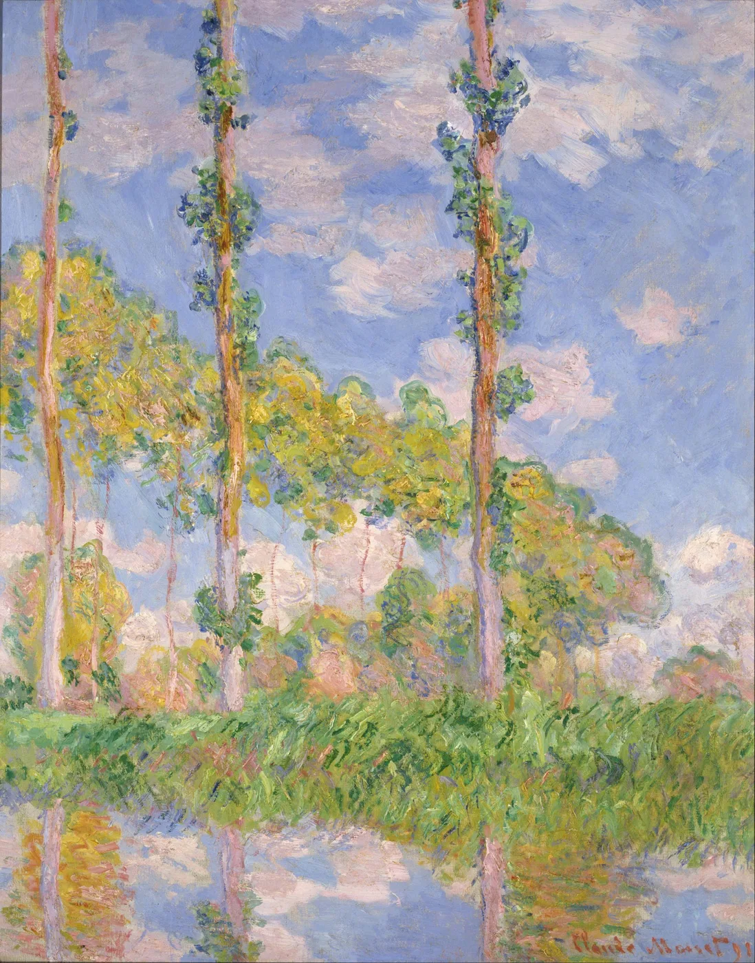
Warm evening or early morning light is the trap that has destroyed more landscape paintings than any other condition, because pink goes sugary almost instantly. What keeps this one honest is that the pink is not everywhere. It is concentrated in the sky and its reflection, and it is held in check by cool greens and blue greys in the foliage, which sit next to it as opposites.
Look at how he handles the trees themselves against that sky. They are not brown or black. Against a pink ground, foliage at this hour goes deep blue green and slightly violet, and the trunks pick up a warm edge only where the low light catches them down one side. That single warm line running down the sunward edge of a cool trunk is doing enormous work. It is the whole reason the trees look round and lit rather than pasted on.
Then look at the saturation. The most intense colour in the picture is usually a small area, not a large one. He builds the effect by keeping most of the canvas in a soft muted range and letting one or two passages carry the heat. Spread that intensity across the whole surface and it stops reading as light and starts reading as decoration.
What to look at once you notice the symmetry
Put a finger horizontally along the line where the bank meets the water. Everything above is the world. Everything below is the same world, reversed, slightly softened and slightly cooler. That mirror is the structural joke of the picture and he plays it absolutely straight.
Now compare the two halves properly. The reflection is never an exact copy. Reflected colour is always a little duller and a little darker than the source, and the reflected shapes are stretched vertically. He observes this, and it is why the water reads as water rather than as a folded piece of paper.
Look at the spacing of the trunks. Because the row recedes, the intervals get narrower as they go, compressing towards one side of the canvas. Your eye reads that compression as speed. It is the same effect as a line of telegraph poles from a moving train, and it is what stops a picture of evenly spaced verticals from being static.
Look at the top of the canvas, where the crowns are often cut off by the frame. That crop is deliberate. It refuses to let the trees be whole objects with tidy tops, which forces you to read them as a pattern extending beyond the picture rather than as portraits of individual trees.
Look at the paint in the water. It will be laid on in horizontal strokes, quite long and quite smooth compared to the broken vertical touches in the foliage. The handling itself distinguishes solid from liquid before your brain even gets involved.
And look at how the row curves. A planted line of trees along a river bank follows the river, which means it is never actually straight. The trunks describe a shallow arc across the canvas, and because they are evenly spaced along a curve, the intervals between them read as a rhythm that speeds up and slows down rather than a metronome. That slight bend is the difference between a pattern and a place. It is also what allows the row to leave the picture at one side and imply that it carries on for a considerable distance, which is exactly what it did.
How it lives on a wall
This is a picture with a strong internal calm and a very controlled palette: rose, cool green, silver grey, and a soft warm light. It does what almost nothing else does, which is add warmth without adding energy.
That combination makes it excellent in spaces meant for winding down. A bedroom, a reading corner, the wall you face from a bath, the end of a landing. It has enough structure to be interesting and not enough incident to be distracting.
The vertical rhythm of the trunks means it flatters tall walls and narrow spaces, and the mirrored composition means it is one of the few landscape images that looks completely resolved hung on its own, without needing a partner to balance it. The symmetry does that job internally.
Against pale warm walls it becomes soft and atmospheric. Against a deeper green or slate wall the pink lifts out of it and glows. Avoid hanging it somewhere with harsh cool overhead lighting, which strips the warm notes and leaves the greys looking flat.
The quiet one in a series about time
Between them, the poplar canvases show the same trees in wind, in flat daylight, in strong colour and in this stillness. Only one of them is calm, and it is worth remembering that the calm was bought. The picture exists because the man who painted it refused to let the subject be cut down before he had seen it in every light it could produce.
This one is held by the Dallas Museum of Art. It records the short window at the edge of a day when the river went still and the sky turned pink over a row of trees that, by then, belonged to him.
Sizes and materials for Poplars, Pink Effect are listed on its product page.
More from this collection
Bring this painting home
Choose a hand-painted oil reproduction for real brushwork, or an archival canvas print for a crisp museum-image edition. Every size preserves the original proportions.
View this work & options
Further reading
Verify the original in the Dallas Museum of Art collection record and continue through related works in the catalogue.