
Low Tide at Pourville: Painting a Landscape the Sea Was About to Take Back
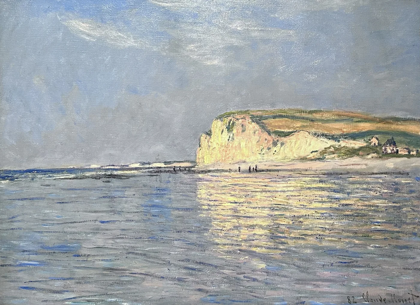
When the tide goes out at Pourville it takes the sea a long way with it and leaves behind something that is neither land nor water. Wet sand holds the sky like a bad mirror. Rock shelves come up black with weed, slick enough to put you down hard. Pools sit in the hollows reflecting cloud. The air smells of salt and iodine and something faintly rotten, and the whole thing has a countdown on it, because in a few hours the sea will come back and take the entire landscape away again.
In 1882 a painter in his early forties stood in that landscape with his canvas weighted down against the wind, working faster than he wanted to.
The campaign years
The early 1880s were spent working this coast in long stretches, Pourville, Varengeville, Dieppe, cliffs and beaches and the sea below them. These were not sketching holidays. He would take lodgings, go out daily, run several canvases at once and stay until the weather had given him what he came for or had refused so completely that there was nothing to do but leave.
The conditions were genuinely hostile. Wind on an exposed clifftop will take a canvas out of your hands and turn an easel into a sail. The standard defences are crude and effective, stones or heavy bags hung on the easel, the canvas lashed down, your own body used as a windbreak. Rain arrives from the sea with almost no warning and can end a session in ninety seconds. Sea spray carries salt onto wet paint. Cold makes fingers stupid.
Then there is the particular cruelty of tidal work. Low tide gives you a subject that exists for a few hours and then dismantles itself. Come back tomorrow and the low water will be at a different time, in different light, and the sand will have been rewritten by the sea overnight. Some pictures could only be advanced in a narrow window on a handful of days, and if the sky was wrong on those days, the window closed.
This is why weeks of work could come to nothing. It is also why a coastal painting from these years, when it works, has such an odd charge of urgency in it. The man making it knew exactly how many minutes he had.
It is worth being honest about the failure rate on a campaign like this, because nobody hangs the failures. A stretch of weeks on that coast might produce a handful of canvases that hold together, a larger number that were begun and never resolved, and a fair amount of time spent sitting indoors watching rain move up the Channel. The pictures that survive from these years are the successful minority of a much larger, much more frustrating body of effort. Knowing that changes how a finished coastal painting looks. It is not a record of a pleasant morning. It is the one morning in ten that behaved.
The picture the water leaves behind
What drew him to low tide was not the beach as a place but the beach as a surface. When the sea withdraws, the sand it leaves is wet, and wet sand is one of the strangest optical objects in nature. It is roughly horizontal and mildly reflective, so it borrows the colour of the sky and hands it back slightly darker and slightly warmer, and it changes second by second as the film of water drains away.
That is why so much of this canvas is given over to the foreground. Look at how far up the picture the wet sand extends and how little room the sea itself is allowed. The nominal subject, the sea, is a band. The real subject, the ground that the sea has abandoned, occupies most of the space.
The composition works in belts, and the pleasure of the picture is largely in how those belts are pitched against each other. Sky, then sea, then the darker line of weed and exposed rock, then the pale mirroring sand, then the coarser dry sand nearest you. Each has its own value and its own kind of brushwork, and none of them is separated from its neighbour by a drawn line.
What to look at
Begin by finding the wettest patch. It is usually the lightest and the most sky coloured part of the whole beach, and it will contain blues and pale violets that have no business being on sand. Then find the driest, near the bottom edge, and see how much warmer and more granular it is, painted with a drier, scrubbier stroke.
Now look at the direction of the marks. On the sea they run horizontally. On the wet sand they run horizontally too, but longer and thinner, so that the flatness is emphasised. On the rocks they turn short and choppy and go in several directions at once. Your eye reads texture almost entirely from those changes of direction, without a single edge being drawn.
Look for the figures next. There are usually a few, small, dark, bent over, gathering something from the rocks. They are not decoration and they are not tourists. A tidal shelf is a food source, and the presence of people working it tells you what this beach was for. They also give the space its scale. Cover them and the picture loses several hundred yards of depth.
Then find the horizon, and check it against the top of the cliff or the frame. It sits high, which is what pushes the beach toward you and makes the foreground dominant. A low horizon would have given you a sky picture. A high one gives you a ground picture, and this is very much a ground picture.
Last, look at the colour of the water where it meets the sand. That transition is where the painting proves itself. Done badly, the sea sits on top of the beach like a strip of paper. Done well, and it is done well here, the water thins out, loses its own colour, and becomes the sand seen through half an inch of moving liquid.
How it behaves at home
Horizontal band compositions are the easiest paintings to live with, because the eye moves across them rather than into them, and that lateral movement is restful. This is a picture you can have in a room you use every day without ever feeling addressed by it.
The palette is cool, sand and slate and a muted green blue, with no strong accent anywhere. That makes it a natural fit for rooms with white or pale grey walls, and a good neighbour to other pictures, because it will not dominate a group. If you are building a wall of several works, this is the piece that holds the others together.
Hang it at eye level or a touch below and give it a wide, quiet space. Because the composition is built on horizontals, it visually stretches a wall, which can be useful in a narrow room. Above a low console or a bed it will make the wall read as broader than it is.
It is also a good picture for daylight rather than lamplight. Cool artificial light keeps its blues honest, while very warm bulbs will pull the sand toward yellow and lose the damp. Put it somewhere with a real window nearby and the picture will do the thing it was made to do, which is to make you notice how much of an afternoon’s light is being handed back up at you by the ground.
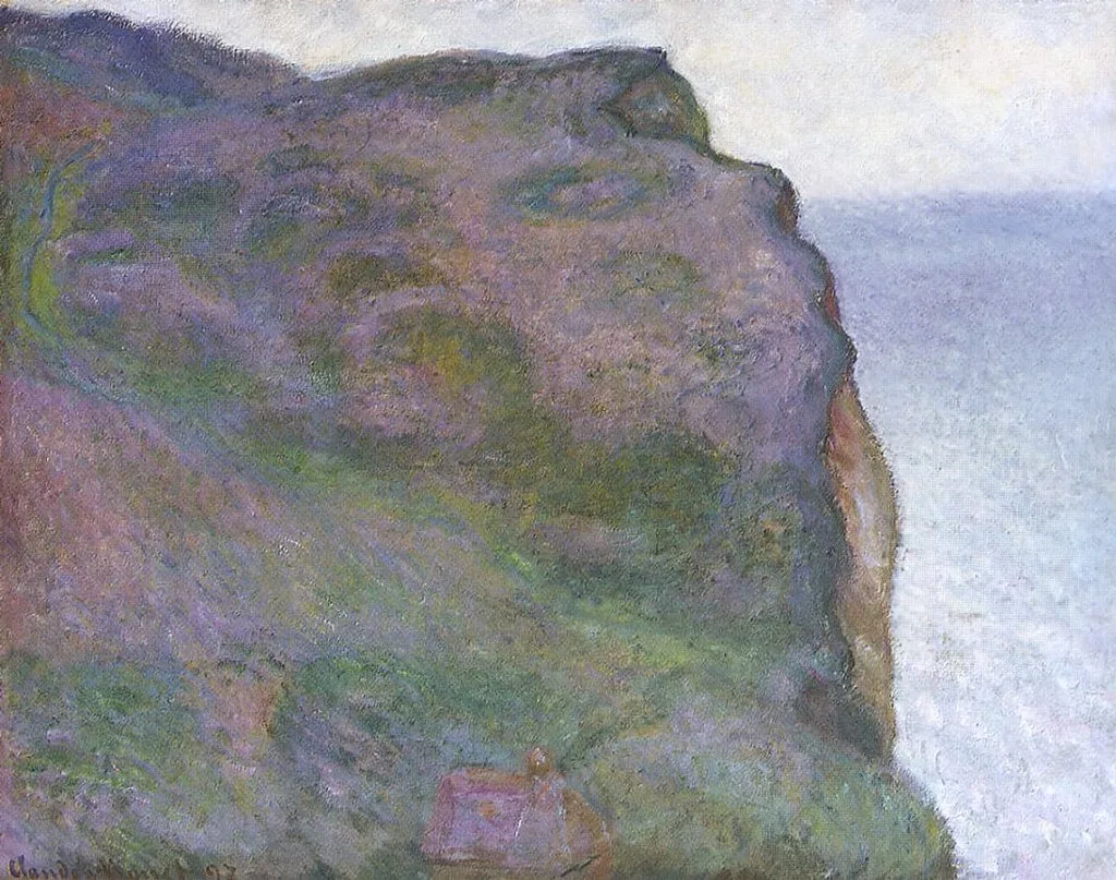
Sizes and materials for Low Tide at Pourville, near Dieppe, 1882 are listed on its product page.
More from this collection
Bring this painting home
Choose a hand-painted oil reproduction for real brushwork, or an archival canvas print for a crisp museum-image edition. Every size preserves the original proportions.
View this work & options
Further reading
Verify the original in the Cleveland Museum of Art collection record and continue through related works in the catalogue.