
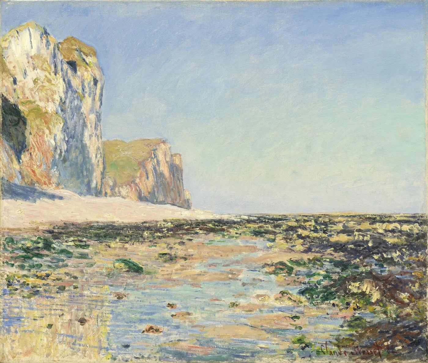
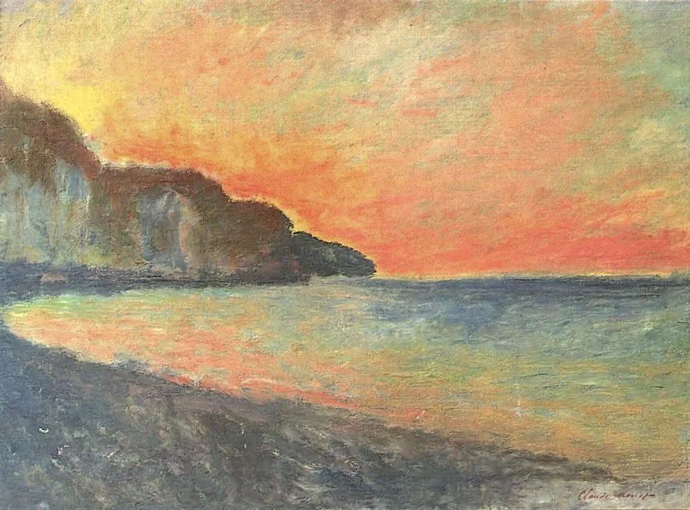
Seashore and Cliffs of Pourville in the Morning
Wind is the enemy nobody mentions. A stretched canvas on an easel is a sail, and on an exposed cliff path in the morning it will try to leave. Painters working that coast weighted their gear, wedged the legs into the turf, tied things down, and still lost days. Add salt spray drying on the surface of wet paint, sand carried up the face of the cliff, cold hands, and a path that is only safe in certain places, and the romance of the seaside motif starts to look like manual labour.
Monet worked the Normandy coast repeatedly in the early 1880s, at Pourville, Varengeville and Dieppe. He was in his early forties. Camille had died in 1879, aged thirty-two, and the years immediately after are the years he went out to the cliffs and stayed there for weeks at a time, painting chalk, water and weather in conditions that would drive most people indoors.
The tide writes the schedule
On this coast the sea decides everything. A motif seen from the beach exists only between tides. The rocks you are standing on are underwater twice a day, the reflected light off wet sand changes as the water retreats, and the walk back is not always available later.
So the working day was not organised around the artist’s convenience. It was organised around a table of times set by the moon. A morning canvas like this one could be worked only in a specific band of hours, in a specific state of light, at a specific stage of the tide, and the number of days per month when all three coincide is small.
That constraint changed his practice permanently. The coast taught him to accept that a motif is a set of conditions, not a place. Within a decade he would apply exactly that logic to grainstacks and to a cathedral front, working several canvases at once and switching as the light moved. The method was learned in the wind, on chalk.
What morning does to a chalk coast
Chalk is the reason this coastline photographs badly and paints beautifully. It is not white. It is a pale grey-cream that takes on whatever colour is in the air, so at dawn it goes lilac and rose, by midday it bleaches out, and in the evening it turns apricot and then blue.
In the morning, with the sun still low and the air carrying moisture off the water, the cliff face here holds cool pinks and violets in its shadowed hollows and a thin warm light along its upper edge. The sea below sits in bands: a greener, more opaque strip where the water is shallow over sand, a colder blue further out, and a paler line where distance and haze take the colour out altogether.
Those bands are the structure of the whole picture. Notice that there is no drawn perspective anywhere in the canvas. Depth is created entirely by changes in colour temperature and by the softening of edges as things recede. That is the coastal painter’s toolkit, and it works because the sea has no landmarks to measure by.
The making
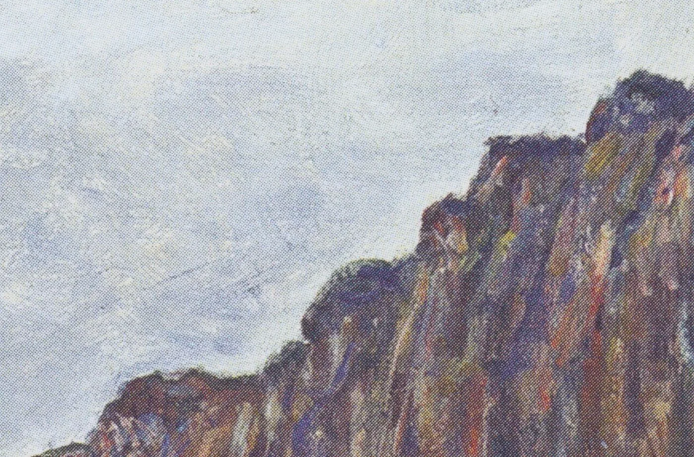
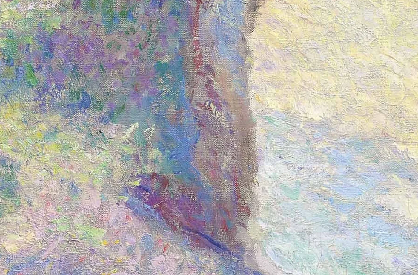
The paint is applied briskly, in short directional strokes that change character depending on what they describe. The cliff is built with strokes that follow the fall of the face, so the brush marks themselves make the rock feel like it has grain and slope. The sea is horizontal, laid in long dragged touches. The sky is softer and thinner, often with the canvas showing through, because a morning sky is the least substantial thing in the field of view and painting it thickly would make it heavy.
The vegetation on the clifftop, where it appears, is dabbed and scrubbed in a third rhythm entirely. Three surfaces, three kinds of mark. Once you notice this you cannot stop noticing it, and it explains why the picture feels physically true even though almost nothing in it is drawn.
Standing where it was made
It helps to reconstruct the position. To see a coast this way you have to be out on it, on turf or shingle, with the wind coming off the water into your face and your back to the land. There is no bench, no vantage point, no comfortable arrangement. The place where the composition works is wherever it happens to be, and it is usually somewhere awkward.
The sound is part of it. Sea on shingle is a continuous noise that removes every other sound, and standing in it for three hours does something to the attention. So does the cold. Hands stiffen, and stiff hands make broader strokes, which is one reason coastal paintings often look bolder than garden paintings by the same person.
Then the weather turns, as it does on that coast, and the light you came for goes behind a wall of grey coming in from the west. You have perhaps ten minutes of warning. Everything gets packed, the wet canvas is carried face out so nothing touches it, and you walk back up a path with a box of paint banging against your leg.
Monet did this repeatedly, over several campaigns in the early 1880s, in his forties, in the years just after Camille died. It is worth holding those two facts together. A man who has recently lost his wife took himself to an exposed coast and spent weeks alone in front of the sea, working to a schedule set by tides. Whatever else that was, it was not a holiday.
What to look at now
- Start with the horizon line and check how soft it is. On a clear morning with haze off the water, sea and sky nearly meet in value. Monet refuses to sharpen it for legibility.
- Look for the darkest point on the cliff. It will be in a hollow or an overhang, and it will be violet or blue-green rather than brown. That single decision is what makes the chalk read as chalk.
- Compare the sea colour close to shore with the sea colour at the horizon and note that they are almost unrelated hues.
- Find the place where the paint is thinnest. It is nearly always the sky. Thin paint reads as air; thick paint reads as substance.
- Then step back and let the whole thing settle into a coast. The distance where the strokes vanish is where the painting starts working.
How it behaves on a real wall
Coast paintings behave differently from river and garden pictures because they contain a large area of near-empty space. That emptiness is a gift in a busy room. It gives the eye somewhere to rest and it makes a small wall feel wider than it is.
The palette here is cool and light overall, blue-greens, chalk creams, cool pinks, so it sits comfortably in bright rooms and in rooms with a lot of white. It will look washed out in a dim corner. This one genuinely wants daylight, or good clean light in the evening. Warm yellow lamps push the cliff toward orange and lose the morning quality entirely, so a cooler bulb is worth the trouble.
Because the composition is built on horizontal bands, it likes a horizontal wall and it strongly dislikes being crowded from the sides. Hang it slightly below standing eye level so that the horizon in the picture falls near your own, which is what makes a sea painting feel like a view rather than a picture of a view.
It pairs naturally with pale wood, linen, plaster, stone and anything sun-bleached, and it is one of the few Monet subjects that works genuinely well in a bathroom or a bedroom with morning light. Put it where the first light of your own day reaches it and the painting and the room will be doing the same thing at the same hour.
Sizes and materials for Seashore and Cliffs of Pourville in the Morning are listed on its product page.
More from this collection
Bring this painting home
Choose a hand-painted oil reproduction for real brushwork, or an archival canvas print for a crisp museum-image edition. Every size preserves the original proportions.
View this work & options
Further reading
Verify the original in the Tokyo Fuji Art Museum collection record and continue through related works in the catalogue.