
The Beach at Sainte-Adresse: The Summer He Could Not Afford to Leave
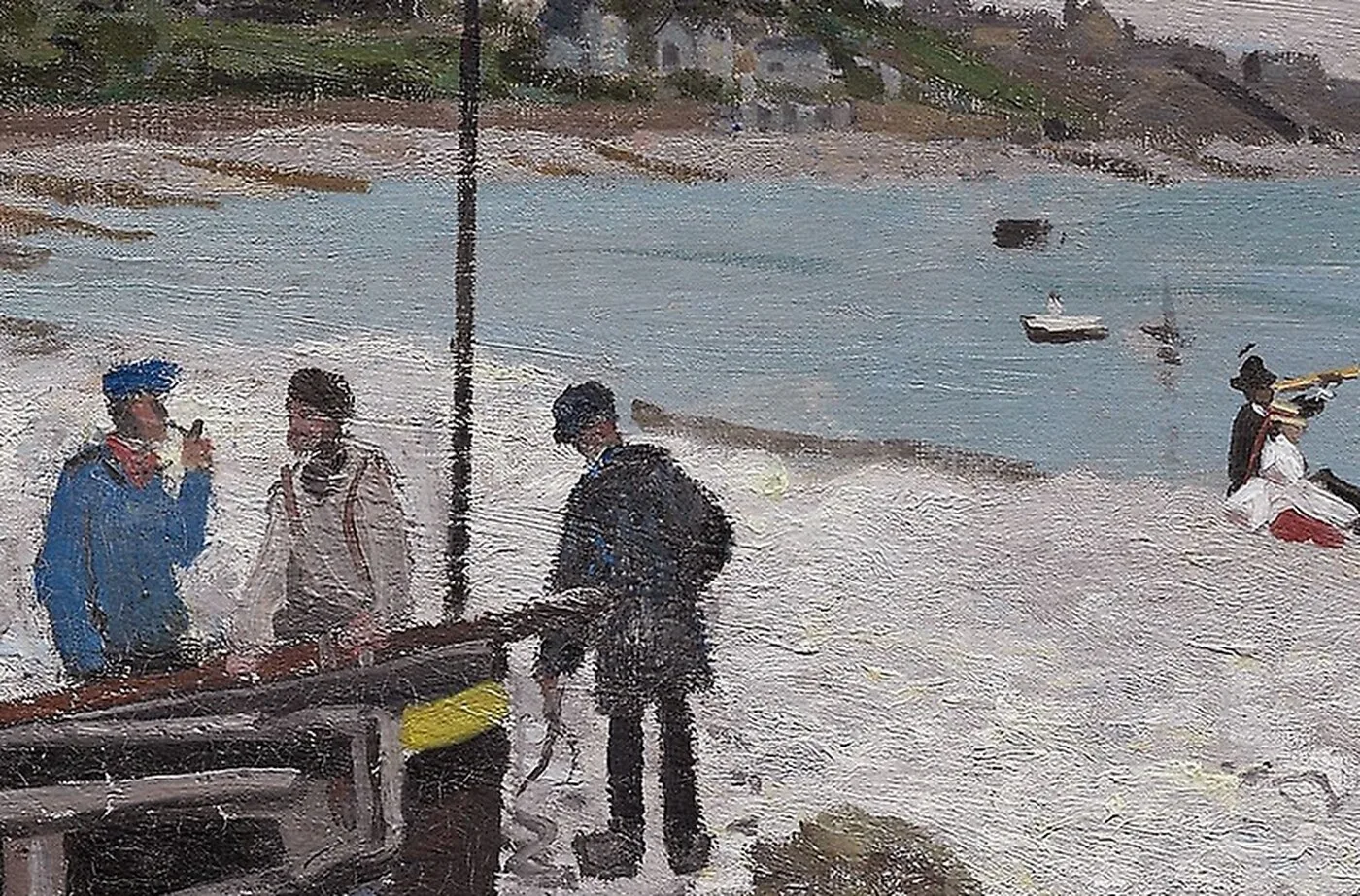
Come down onto the shingle at Sainte-Adresse on a grey morning and the first thing you notice is the sound. The Channel does not crash here so much as drag. Stones roll back under each wave with a long rattling sigh, and then the next one lands on top of them. The wind is steady and low and carries salt into the seams of your coat. The light is nothing like a postcard. It is pewter and wet sand and a green that has no proper name, and the sky takes up far more of the world than seems reasonable.
That was the weather a twenty six year old painter stood in during the summer of 1867, on a stretch of coast he had known since boyhood, holding a brush and thinking about something happening a long way inland.
The summer he could not afford to leave
He was not there for the sea air. He was there because it was free. His family kept a household on that coast near Le Havre, and a young painter with no buyers could eat at their table and sleep under their roof and walk out each morning to a motif that cost him nothing but the price of paint. The arrangement had one condition attached, and it was not a small one. The money and the welcome depended on his behaviour, and on his behaviour being the kind his family approved of.
In Paris, Camille was pregnant. She was the fact he could not bring with him and could not put down. Everything he wanted was in one city and everything that kept him fed was on this beach, and the whole summer sat in the gap between the two. You can read that as a young man’s romance if you like, but it was mostly arithmetic, the ugly kind, done late at night by someone who has not sold anything and is about to become a father.
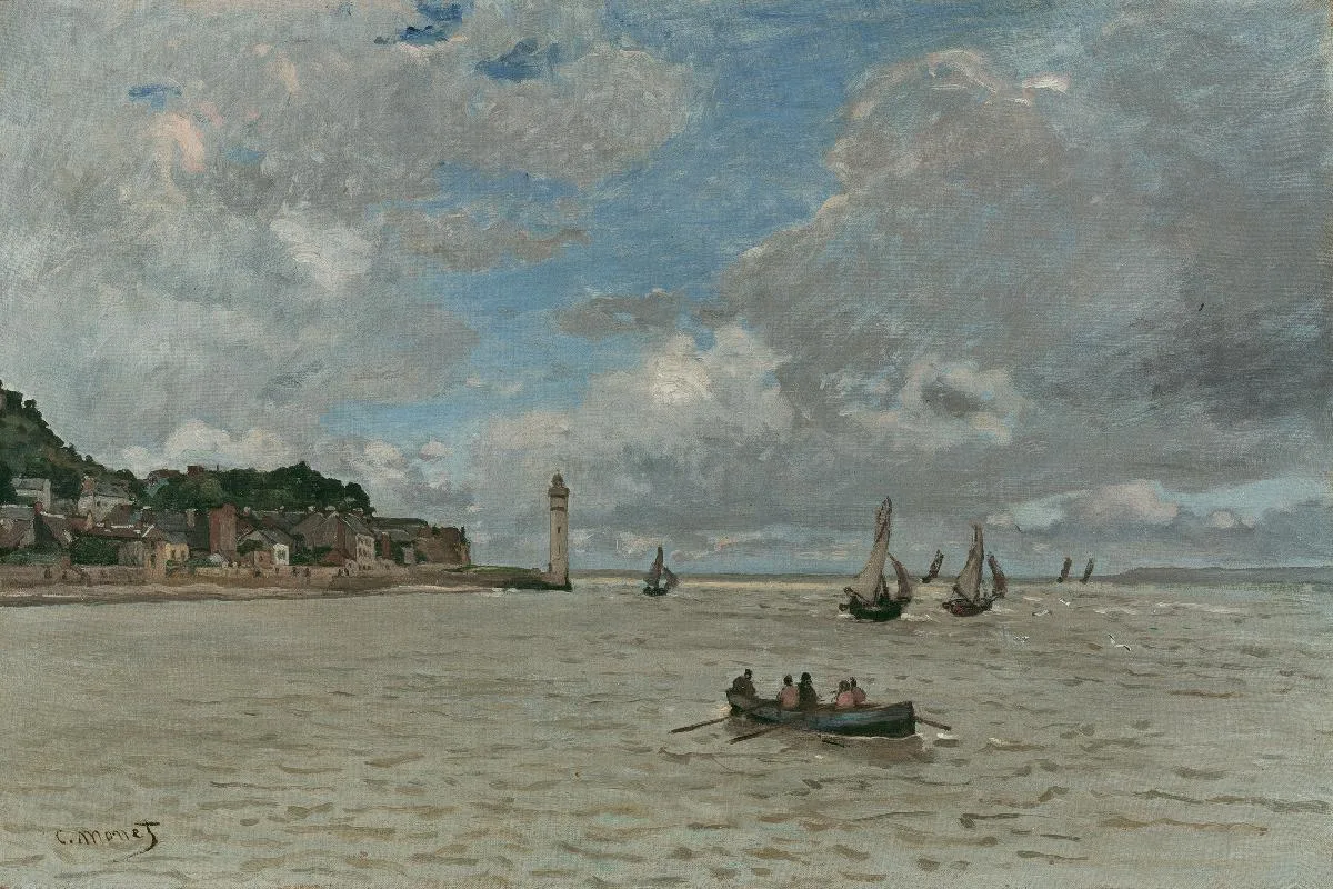
Nothing in the painting announces this. That is worth saying plainly, because a picture is not a diary. What the situation gives the work is not sadness but attention. A man with nowhere else to be and no way to fix what is wrong will look very hard at whatever is in front of him. The beach got the full weight of that looking.
A grey day, chosen on purpose
Almost anyone else would have waited for the blue day. Bright water, white sails, holidaymakers in good clothes, the coast as it appears in the minds of people who visit it for two weeks a year. He painted the other kind of day, the overcast one that locals know is the real climate of the place, and he treated it as a subject worthy of serious effort rather than an inconvenience to sit out.
Overcast is much harder than sunshine. Sunlight hands you contrast for free. It gives you a dark side and a light side and clean shadows that tell you where everything sits in space. Take the sun away and all of that support disappears. You are left with a field of close values, sky and sea and sand separated by almost nothing, and if you get those relationships even slightly wrong the whole picture turns to mud. The only way through is to stop naming colours and start measuring them against each other.
The physical business of doing this on a beach is its own problem. There is no shade to stand in and no shelter to retreat to. Sand travels on the wind and lands in wet paint. The tide moves the shoreline while you work, so the shape you drew an hour ago is no longer the shape in front of you. Boats that were beached and still get pushed and floated and rowed away. Whatever you commit to early, you are stuck with, and the surface has to be built quickly enough to keep the day’s particular greyness intact.
What to look at once you slow down
Start with the horizon, and notice how much sky he allowed himself. The division between water and air is the spine of the picture, and everything else is arranged in relation to it. Cover the sky with your hand and the beach becomes an ordinary strip of coast. Uncover it and the beach becomes small, which is exactly how a beach feels when the weather is up.
Then look at the greys, and keep looking until they come apart. There is a warm grey in the sand with a pinkish cast to it. There is a cooler, greener grey in the water. The clouds carry lilac and a dirty cream, and here and there a paler patch marks where the sun is trying and failing to get through. None of these are grey in the tube sense. Grey is what the eye reports from a distance, and the painting’s job is to earn that report using colours that are not grey at all.
The boats are the anchors. Their hulls are the darkest notes in the whole canvas, and they do the structural work that the light refuses to do. Without them the picture would drift. Cover them and you can feel the composition go slack.
Finally the figures. They have no faces and were never meant to. They are marks, placed for scale and for rhythm, spaced along the sand the way people actually space themselves when they are not posing. They tell you how big the boats are and how far away the water is, and they give the eye somewhere to rest on its way across. Watch how few strokes each one takes. That economy is not carelessness. It is a decision about what a person is worth in a picture whose real subject is weather.
How it behaves on a real wall
Low chroma paintings are the quiet workhorses of a home. This one has almost no loud colour in it, which means it will not argue with your walls, your rugs or anything else already hanging. Put a high saturation picture next to a sofa and one of them loses. Put this one there and the room simply gets deeper.
It is at its best in rooms with cool natural light, the kind that comes from a window facing away from the sun, because the painting and the room end up telling the same story about the day. In a warm lamplit room at night it does something different and just as good. The sand notes pick up the bulb colour and the whole surface goes softer and a little more amber, so you get two versions of the same picture depending on the hour.
It also rewards distance, which affects where you should hang it. Close up you see brushwork and separate colours. Step back six or eight feet and everything fuses into weather. That makes it a good candidate for the wall you see from across a room, at the end of a hallway, or opposite the place where people actually sit, rather than a spot you only ever pass at arm’s length.
Give it horizontal breathing room if you can. The composition is built on long bands, and it reads best above something long and low, a sideboard, a bench, the back of a sofa, where the eye can run along it without interruption. Hang it slightly lower than you think. The horizon wants to sit near your own eye height, and when it does, the thing stops being a decorated rectangle and starts behaving like an opening in the wall onto a cold bright morning that someone stood through, once, for reasons that had very little to do with the view.
Sizes and materials for The Beach at Sainte-Adresse are listed on its product page.
More from this collection
Bring this painting home
Choose a hand-painted oil reproduction for real brushwork, or an archival canvas print for a crisp museum-image edition. Every size preserves the original proportions.
View this work & options
Further reading
Verify the original in the The Art Institute of Chicago collection record and continue through related works in the catalogue.