
Gardener’s House at Antibes: The Light That Nearly Beat Him
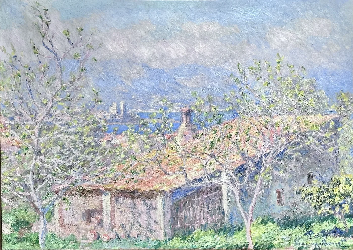
By eleven in the morning at Antibes in early spring the light has stopped behaving the way northern light behaves. It does not describe things, it attacks them. Whitewashed walls throw so much glare that you cannot look straight at them. The sea is not blue in any usable sense, it is a sheet of reflected sky with a hard silver line across the middle. Shadows are not dark. They are cool, coloured, and full of the same brightness bouncing off the ground into them.
A painter who had spent twenty five years learning the greys of a northern coast came here in 1888 and discovered that his skills had partly stopped working.
The trouble with a beautiful problem
Everything about the south should have been a gift. The weather is reliable. The days are long. The colour is extravagant. And yet this was one of the harder campaigns of his life, because the difficulty was not weather, it was the paint itself.
Here is the plain physics of it. The brightest white pigment available is enormously darker than actual sunlight on a wall. In the north that gap barely matters, because the light is soft and the range you have to compress is small. In the south the range is huge, and the top of it is simply unreachable. You cannot paint the glare. You can only construct a set of relationships that make the eye behave as if it had been glared at.
That is why so much of this picture is done in a high key, with almost nothing genuinely dark in it. To make a wall look blinding you must lift everything else, the shade, the earth, the sea, the sky, until the whole canvas is up near the ceiling of what the pigment can do and the contrasts are made from colour rather than from darkness. It is like being asked to write a loud sentence without using capital letters.
The other risk was worse. Light like this makes everything look lovely by default. A painter who trusted it could produce something sweet, false, and instantly forgettable. Getting the south right meant finding a way to be truthful about a place that flatters everything, including the person painting it.
The campaign itself was long and it was not comfortable. He stayed on that coast through the early months of 1888 and worked it the way he worked everywhere, going out at the same hours, keeping several canvases in progress at once, returning to each one when the light came back round to the state it had been in. In the north that system was a defence against changeable weather. Here the weather was almost too obliging, and the enemy became the sheer speed at which the sun moved through its range. The colour of a wall at ten was not the colour of the same wall at eleven, and neither was worth having if you had already mixed for the other one.
How he handled it
The first decision is the structure. The picture is not a view of the sea with a house in it. It is a small building, low, ordinary, a gardener’s house rather than a villa, held inside a screen of trees, with the distance visible past it. Trees near, house middle, water and hills far. That gives him three depths to keep separate at a moment when the light is trying to fuse everything into one glare.
The second is the treatment of shadow. Look for the shaded side of the house and the shade under the trees, and notice there is no black or brown anywhere in them. They are blue, violet, sometimes green, and they are lighter than you expect. This is not stylisation. On a very bright day the sky and the ground genuinely fill shadow with reflected colour, and painting shadows as an absence of light is the fastest way to make a sunlit scene look like a photograph taken indoors.
The third is touch. The strokes are small, separate and layered rather than blended, which keeps the surface vibrating. Blending would settle the colour down and kill exactly the shimmer he was chasing. Up close, the foliage is a chaos of pinks, oranges and greens sitting side by side without ever mixing. Step back and it becomes a tree with the sun in it.
Teaching your eye to read it
Start with the house, because it is your key to everything else. Find its lit wall and accept that as the brightest note in the picture. Now compare every other pale area to it, the sky, the sea, the pale ground. You will find they are all slightly below it, and once you see that ranking you understand how the illusion is built.
Then look at the trunks and branches of the trees in front. They are drawn with a nervous, broken line and they cross the picture like a grille. Their job is to keep you from falling straight into the distance. Cover them and the depth collapses.
Next, find the horizon out at sea and follow it. It is stated very softly, sometimes barely at all, and the water above and below it changes colour in bands. Distance here is carried entirely by those bands, not by any drawing.
Now go hunting for pink. It is in the walls, in the ground, in the hills across the water, in the underside of the foliage. Pink is the connective tissue of the whole canvas, and it is the single clearest signal that this is southern light rather than remembered light. It is also the colour that makes people say a painting glows, without their being able to say why.
Finally, stand back and let the surface do its work. From two feet you see a crust of separate colours. From ten you see heat.
Where it belongs in a house
This is a strong performer in rooms that do not get enough sun. The picture supplies what the room lacks, and because its brightness comes from colour rather than from raw white, it does not go flat or chalky in dim conditions. On a wall facing away from the light it can behave like a second window.
Be careful about what you put beside it. A high key painting sitting next to a very dark object will lose, because the eye reads the darkest thing in a field as the anchor and everything else becomes pale by comparison. Give it lighter surroundings and it holds its own easily. Pale walls, natural wood, off white plaster, soft textiles.
It is also a picture with a temperature, and the temperature is warm. In a room already full of warm tones it will feel generous and coherent. In a cool grey room it will feel like a deliberate hot spot, which can be very effective if you commit to it and slightly odd if you do not.
Hang it where people arrive rather than where they settle. An entrance, a landing, the wall you see when you come through a door. It is a picture about the shock of walking into strong light from somewhere shaded, and it works best when the room lets you have that experience physically, one step at a time, the way he had it every morning while trying to work out how on earth to paint it.
Sizes and materials for Gardener’s House at Antibes are listed on its product page.
More from this collection
Bring this painting home
Choose a hand-painted oil reproduction for real brushwork, or an archival canvas print for a crisp museum-image edition. Every size preserves the original proportions.
View this work & options
Further reading
Verify the original in the Cleveland Museum of Art collection record and continue through related works in the catalogue.